The 2024 Paris Olympics has come and gone, but the uniforms worn by teams from different countries made a huge impression on the world. Some outfits were astonishingly beautiful, while others were indescribably off. We’ve presented a list of the best and worst uniforms, arranged in order of increasing beauty and distaste in each case.
Italy
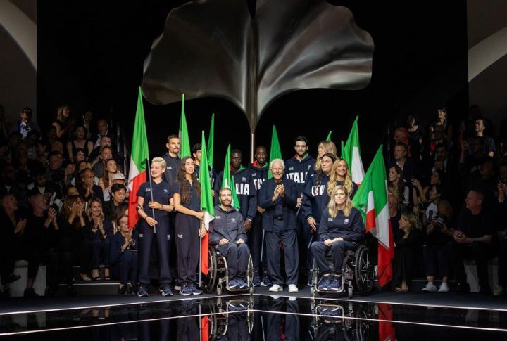
Let’s start with the 7th-best. Italy’s uniform for the 2024 Paris Olympics beautifully combined Italian tradition and modern fashion. Designed by Emporio Armani, the outfit was primarily white with a touch of Italy’s national colors—green, red, and blue. Green and red stripes ran diagonally across the chest, while the blue was subtly integrated into the collar and sleeve cuffs. The fabric is high-tech, lightweight, and eco-friendly.
Canada

Words are not enough to describe the Canadian team’s uniform, which features a bold red and white color scheme that reflects the national flag. Red is accented with white maple leaf motifs on the shoulders and sleeves. The jacket’s inner lining was adorned with a subtle Indigenous pattern, paying homage to Canada’s First Nations. Each outfit, designed by Lululemon, enhanced performance through moisture-wicking fabric and ergonomic cuts.
South Korea
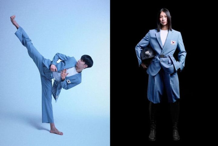
Like their flag, the South Korean team’s uniform featured a sleek, minimalist design dominated by a clean white base. A red-blue-black diagonal stripe, representing the country’s progressive spirit, runs across the chest. This design by Musinsa Standard subtly incorporates patterns inspired by “hanbok,” the traditional Korean attire. These patterns are visible in the texture of the fabric and the cut of the jackets.
Haiti
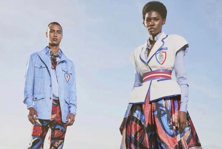
Very few people expected Haiti to pull off such a beautiful fashion display. Dressed to impress the world, the team’s vibrant uniform was a culturally rich representation of the nation. It was crafted by Stella Jean and features a deep, royal blue base with accents of red and gold. Intricate patterns inspired by traditional Haitian art are subtly woven into the fabric, while the aerodynamic cut enhances the athletes’ performance.
USA
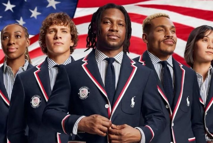
The US is among the top countries with the highest love for fashion. No wonder their team had the third most beautiful uniform at the 2024 Paris Olympics, thanks to Ralph Lauren. The outfit had a classic red, white, and blue color scheme with deep navy blue as its primary hue. Stars on the shoulders and a subtle incorporation of the American flag chest add a patriotic touch.
France
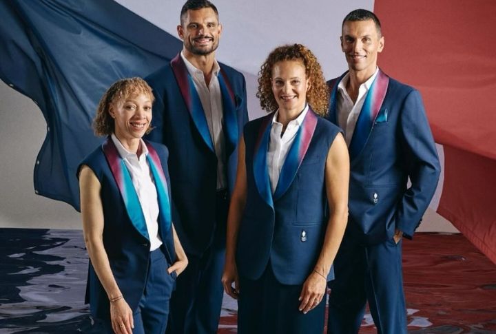
Berluti designed the French team’s uniform. The outfit featured a classic navy blue base, symbolizing the nation’s deep ties to the military and fashion industry. Tricolor elements, including red and white stripes, ran down the sides of the jackets and trousers, while a rooster was subtly embroidered on the chest. Its fabric was also a high-tech, sustainable material that helped athletes remain comfortable.
Mongolia
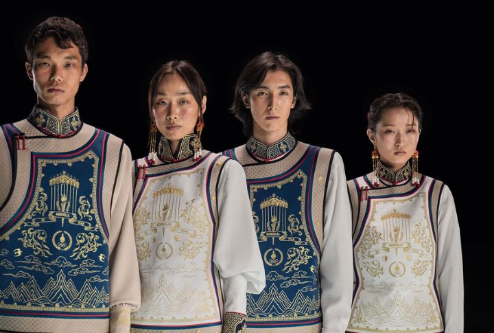
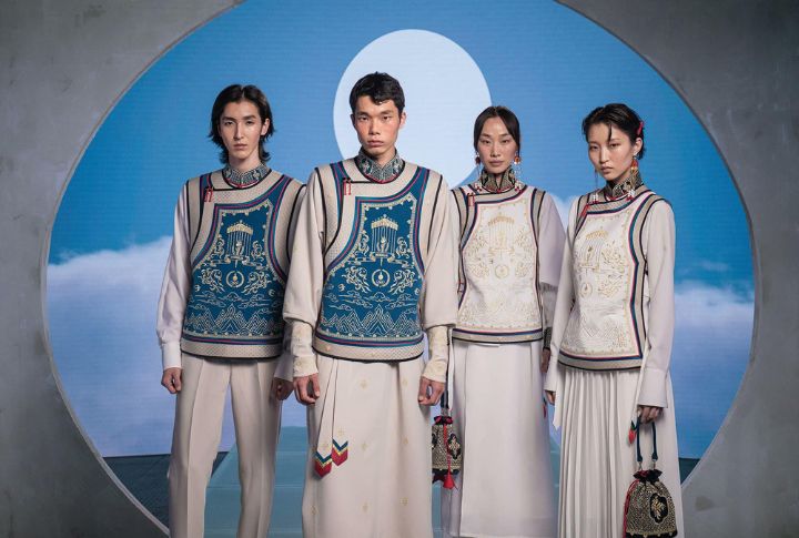
The Mongolian national team’s uniform was designed by Michel & Amazonka. The uniform features a deep blue base, symbolizing the vast Mongolian skies and the nation’s traditional color. Accents of gold thread are intricately woven throughout the design, and the chest is adorned with the iconic Soyombo symbol. The fabric used lightweight materials for flexibility and was carefully crafted to honor Mongolia’s heritage.
Liechtenstein
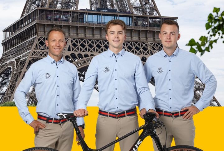
Now to the list of the not-so-impressive Olympic uniforms. The attire worn by Liechtenstein’s delegation looked more like a tech firm’s casual Friday wear than an outfit for an Olympic ceremony. It included plain pieces that lacked vibrancy or national symbolism and a color scheme that failed to evoke any strong sense of pride. Unfortunately, the choice of design and presentation made these uniforms easily forgettable.
Great Britain
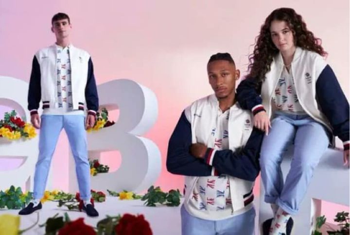
No one expected the fashion fiasco demonstrated by Great Britain’s team. Their uniforms, designed by Ben Sherman, were intended to evoke a sense of modern British style. However, the mostly white jackets paired with light denim jeans resulted in a very scanty look. Though the concept was similar to Team USA’s, it lacked the same level of execution and impact.
Sweden
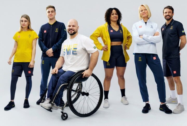
Uniqlo designed Sweden’s uniforms to address the rainy weather in Paris with bright banana-yellow rain gear. While this choice kept the athletes dry, it did not contribute to the visual appeal. The single-color approach made the outfits look more like everyday raincoats than something worthy of an Olympic parade. The lack of any contrasting colors or design elements was far from stylish.
Brazil
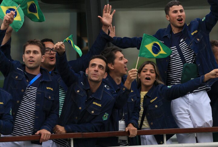
Brazil’s uniforms, created by Nike, were a complete letdown, especially given the nation’s vibrant culture and history of eye-catching designs. The outfits featured dark jackets and drab skirts that did little to convey the lively spirit of Brazil. Its muted color palette was puzzling because the uniforms lacked the flair and energy that one might expect from a Brazilian Olympic team.
Germany
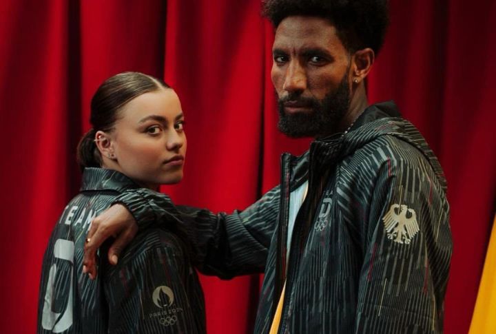
Adidas designed Germany’s uniforms to create a minimalist and functional look. However, the result was too stark and lacked character. The uniforms were primarily gray and black, with very little to distinguish them or inject any national pride. While the designs were practical and well-made, they failed to make an unforgettable statement on the world stage.
Bermuda
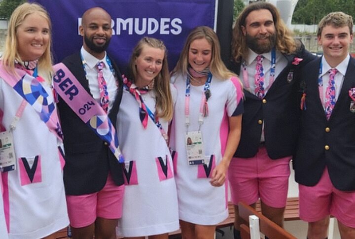
If Bermuda had repeated its signatory outlook, it would have been the usual with no one batting an eyelid. This year, they added printed scarves for women, and their men had matching ties and handkerchiefs, making them look more like a cabin crew team than guests of the Olympics.
Australia
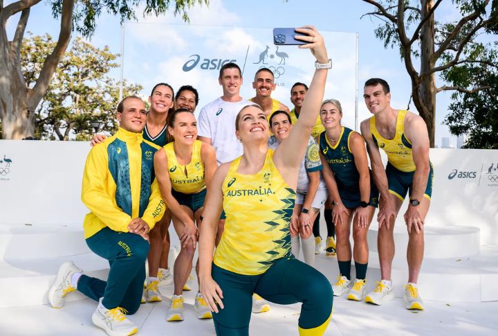
Many people believe Australia’s uniforms were the least impressive in the competition. Designed by Sportscraft, the outfits were overly simplistic, featuring basic cuts and a lack of distinctive highlights. The uniforms were criticized for their lack of creativity and failure to capture Australia’s adventurous spirit. Though traditional, its green and gold color scheme was applied in a way that did not stand out.


