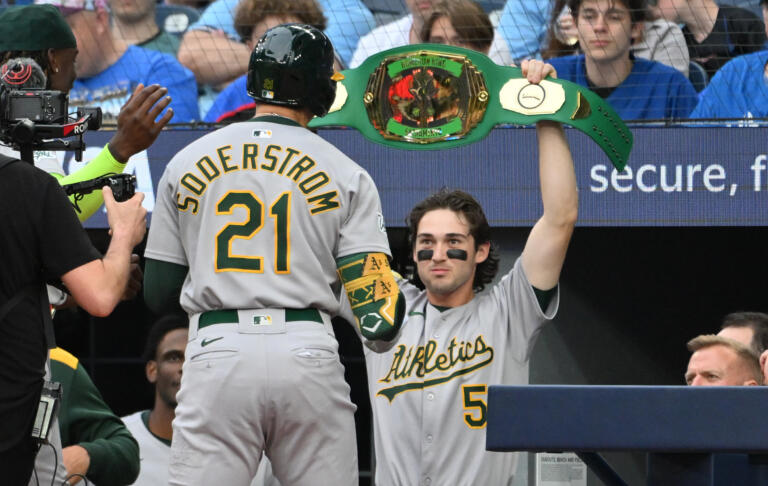
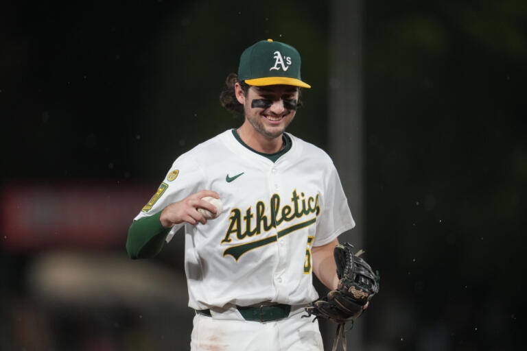
Could Major League Baseball be taking a fashion U-turn? It seems so, after a barrage of criticism about the new jerseys introduced this season. Players and fans alike voiced their displeasure, and it looks like their voices have been heard. The MLB Players Association recently revealed in a communication to its members that the league has committed to making several adjustments to the uniforms, addressing some rather surprising style missteps.
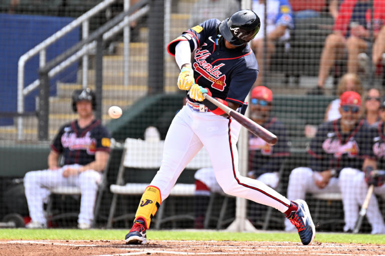
First on the list? Enlarging the lettering on the back of the jerseys. It seems the current design might have left fans squinting from the stands or their couches, trying to spot their favorite players. But that’s not the only issue—there’s also the matter of the see-through pants, a fashion faux pas that players and spectators found less than amusing. It’s quite the slip-up in sports attire, where functionality should ideally meet style without crossing into the territory of unintended transparency!
The planned changes are set to roll out at the beginning of the 2025 season, which gives the league some time to ensure these uniforms are not only visually appealing but also practical and comfortable for the players. This situation is a classic example of “if it ain’t broke, don’t fix it,” but since it did break, it’s good to see MLB isn’t sticking its head in the sand.
This move raises interesting questions about the relationship between athlete comfort, fan experience, and brand presentation in sports. How much should player and public feedback influence the design of sports uniforms? And what are the key lessons here for other leagues and sports brands?
As MLB goes back to the drawing board, other organizations might be taking notes, ensuring they don’t make similar missteps. What’s your take on this? Should sports leagues stick to traditional designs, or is there room for bold, albeit functional, innovations in sports fashion?


